Thursday 19 November 2015

Artist Copy

For my artist copy, I decided to pick a page from a comic book called "Blankets", an autobiography of the author and illustrator, Craig Thompson. Before I could begin copying his art, I needed to analysis the page and decide what media to use, the art he has done was done using a media of ink and brush.


Before I could begin adding ink, I need a guideline to follow to ensure it is as accurate to the original. But to avoid plagiarism, I decided to drawn the pencil guidelines free-hand (Meaning I refrained from tracing the original).


Below is the finished pencil outline put against the original for comparison.


After I had done the guidelines, I was able to begin applying the ink, as the pencil was all my own work, tracing the pencil was not an act of plagiarism, using a light box I was able to see my pencil guidelines previously drawn and apply ink on top of it using a range of brushes for different thicknesses.


I did this technique for each section on a separate piece of paper, some I had made previous mistakes on, and then I improved gradually.


Within Photoshop, for each item I used the threshold tool to make them a solid black and white, to give my piece a bolder style, after this I merged each piece into one final piece that is a better mimic of the original.


After I had pieced it together in Photoshop, I printed it out and this is my final piece, my finished emulation of Craig Thompson's "Blankets".


Below are the two pieces put side by side for comparison. The original on the left, and my emulation on the right.

Tuesday 17 November 2015

Digital Type Ideas

Below are 10 different fonts I had picked up from a free online typeface website called 'dafont'. Written in pink are all the different typography terms I had located within these fonts. And the green is my thoughts on each font and what they could or couldn't bring to my final piece.


Hand Drawn Type Ideas

My hand drawn types have allowed me to gain a basic understand of what type of font I would like my title and other words to be in. It has taught be different styles, and further developed those I already know. I have tried to use my pencil in a wide variety of ways to see which best suits my type of game.


Sunday 20 September 2015

Photo Annotations

"Bottles" was one of the categories I did to allow myself to analyse what photos I had easier due to the large amount taken. Bottles I feel what important for my design, as they can easily bring colour to my work, and often can be used to fill space if needs be. Bottles can carry many different characteristics, such as their logos, shape, etc. These are all factors I tried to take into account when taking the photos. Problems I faced whiles taking these included reflections, the business of the bottles and the clearness of the bottle itself to make out smaller details.


The second category is "Characters", this is a category where I needed a model to get in different positions I would need so I can use it as drawing references when it comes to the final design. These allow me to gain a more accurate detail to my work, these pictures have better quality than the rest, as I was able to set it up to my personal preference. Problems I faced during the taking of these pictures was lighting, although I tried my best to have a single light source, I did not have the resources to completely block the light with caused obvious issues with my work. Another issue was that my model was incapable of remaining in a position for too long, meaning blurry photos would appear.


Third category was "Clothing" this is a category I did based around minor areas within the game. I felt that these photos would allow me to gain a better idea of the clothing for females during the time my game is based around. Some of these will help with drawing references, or even appear as descriptive pieces. The problems I faced whiles taking these were that I was unable to touch most of what I had taken pictures of, meaning angles and positioning would be difficult to work around, but I am glad I gained photos that were usable and clear.


The next category was "Housing and Building". These varied quite a lot as I wanted to make sure I got a sense of the general architecture of the time. Much of what I got I felt was unneeded for physical use, but mentally it gave me a stronger understanding of how things worked so I can create more detailed drawings. The difficulties here were that many things were out of reach, and I was being forced to zoom closer, which, brings my photos into a blurry mess that was not of crisp enough quality to use in my final piece.


One of the categories was "Nature", this was a category I thought would be used rarely yet needed inclusion in case I needed it. The pictures in this category are minimal as my subject matter is usually of urban areas, but I thought the possibility would need decent drawing references so I can capture the finer details within the flower itself. These pictures also show the constructs that have appeared within the nature, meaning to find it untouched is rare. Difficulties I came into when taking these were the positioning, the nature was thin and more often than not, was being shaken by the wind which made it difficult to get everything in the correct position.


This second to last category was "Tools and Equipment", this category I thought could develop my character's designs and angles. Many of these photos will be used as they are the closest I can get to primary resources for the jumbled "broken" messy theme I have for my characters. Difficulties with these included that most items were on a small scale, or that once again, I was unable to get up close and touch the items, so I could not position them correctly.

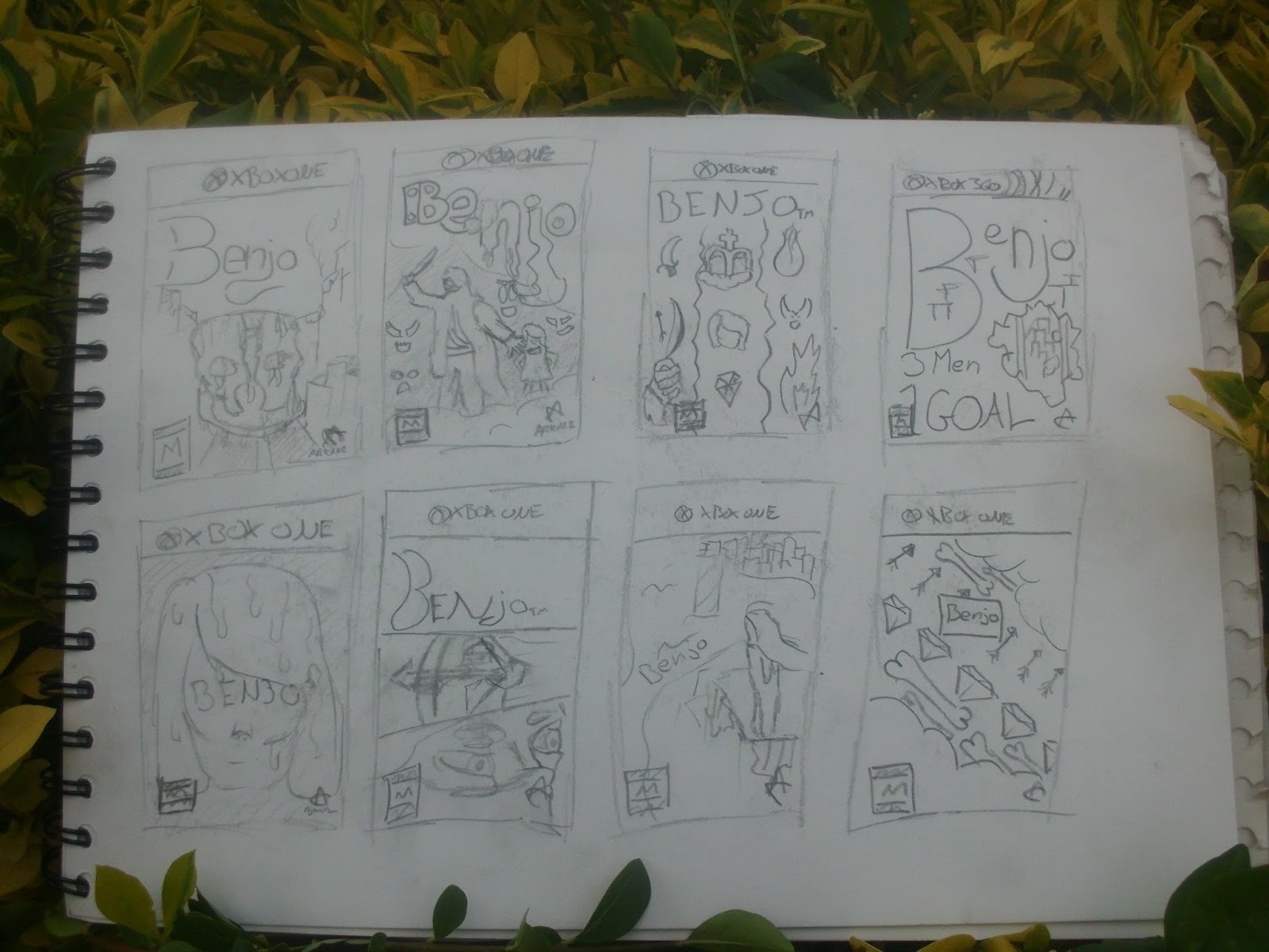
The final category is "Typography" these photos were to help me understand what to do for titles, and font styles in descriptions. They vary, and quite often are very simplistic as finer details were a lot harder to do without the digital tools we have today. Posters appear torn and/or tattered, and I think this could actually be incorporated into my final design.

Friday 11 September 2015

Final Draft

From my previous drafting, I created a rough sketch of what I would like my final draft to look like, but using techniques previously learnt.

Thursday 10 September 2015

Draft from Scamps 4

Below is my finished final draft. I am happy that all my previous drafts have helped build up what I believe to be a near-flawless design which I can then use as reference when creating the real thing. This exercise has helped me understand different uses of media, and the terms followed. The use of arm, allows the details around them to be seen, whiles still making the characters interesting enough to draw the audience in.

The fog is tucked in to fit the content it has inside of it instead of going along a line I had drawn. It helps the quote and title stand out greatly. the white windows are a great inclusion and make the silhouette less bland yet not too eye-catching. And help the theme of night grow around the page.

Draft from Scamps 3

As I develop my designs, my skills have refined as I do so, making a lot of my drawings more crisp and detailed than they were before. There was less for me to improve on this draft, as I believe it was close to what I would like to use for my end piece. However, I still found imperfections that could be changed for my final draft.

For example, my fog in this draft covered too much of the background, and made the draft seem empty and unfinished, this is an effect I wanted to avoid so my game seemed filled with exciting things to my audience. I was going to back this up further by using colours that stand out when I develop my cover to include details such as colours. However, I do believe the wavy extra lines I had added had helped add a sharper texture to the fog, making it appear more defined and more worth of a border.

More imperfections have still been noted, such as on the arm of my third character, the use for the arm has been changed frequently as I develop my character's own custom outfits making them each unique yet still have something in common. But the idea of the third character having a bow, or a torch didn't work and used up valuable space I needed for my silhouetted background, which has vastly improved the quality of my work by allowing the audience to see my characters above all else. So in my final draft, a better use for his hand is needed to give a cleaner effect and make my characters appear to be more huddled together.

Previously, my silhouette was doing a good job of bringing emphasis to the characters, however I wanted a stronger theme of night, so I decided dark buildings with lit up windows would be the answer to solve this, this was more of a test, and I think if I further develop how I have done it, it could be included in my final design.

Draft from Scamps 2

Below, is my second draft. A far greater improvement on the last as I still had a lot of ideas of what I wanted to include. I had completely changed the title, I have it theme-related details such as overgrown vines, brickwork and a mechanical eye, however, I thought that the vines could of given more of a swash effect or be used as tails, I had attempted to do that in this draft, but could be extending to appear more exaggerated. Another issue I found was that the vines and the lines of the letters themselves were very similar widths making it hard to understand what some letters are. For example the 'n' below could be mistaken for a 'r', and the 'j' and a 'i'. I needed to make the letters bold by using my pencil more thickly to give that effect.

The fog I felt, whiles been a more realistic approach than the last draft, still lacked something to make it obvious it is fog, and pleasing to look at. This could also be done by using my pencil in a variety of ways to give a patchy-misty effect to the work.

My characters had definitely improved and gain different costume ideas each time, I am happy with their current size I have made them however the shading given to them was too dark, and often at times hard to see the finer details put into my work. If I were to make them stand out on my page and draw attention to my audience, they needed to be brighter.

A minor flaw I noticed was that the ratings and logos placed on my game cover, were quite large and my space could of been used more wisely to add smaller details to my work and giving the audience a better feel for the game itself. I will make these smaller in further drafts I do and instead use their extra space for fog details or ripples in the water.

Finally, I liked the short quote I had added and thought it was a good addition to fit to the theme of game covers, it will show my audience that my game has been appreciated by popular game critics and that it is a worthwhile title. However, I believe that I could of improved it by displaying it in a way that matches my Victorian-styled theme.

Draft from Scamps 1

Before I could start drafting ideas, I needed to look through my collection of initial scamp designs and choose what I thought would be of good enough standard, below is a picture of my chosen scamp.


When I enlarged my scamp into a starting draft, I needed to take in what else could be added, knowing that I could later change the imperfections, I decided to try different ideas. The title's font I had chosen was quite small, and when looking at other game covers I found small titles did not fit the form. As well as the small font, I notice that my font did not stand out, and blended in with the surrounding detail, so I decided this was to be changed in a future draft.

Another issue I found were that my main characters, whiles needing to be shown to allow the audience a look at what the game could be like, were slightly too big and needed to be downsized so that the smaller details could be added and add more information about the game.

My background allows the audience to understand what sort of setting my game is in, (Fantasy Victorian London), by using iconic landmarks most people could understand, in this case, Big Ben, however I feel the background drew attention away from my main characters, which I still wanted to emphasis, and if I was going to downsize my characters, i'd have to simplify my background, I decided to consider a silhouette, as this would still fit the theme, as in my game cover, it is shown in a night setting.

The water I had made to fill the space I had left, did not have too much showing it off. I felt I would have to add details to it in further drafts to see if it had helped give the theme of a ruined city, possibly by adding rubble into the river, or make the water seem dirty or uneven.

Finally, I found an imperfection with the lower area of my game cover, I wasn't sure what to add there, as it was covered by the "fog" I had added to work as borders, so it doesn't look blocky. But the fog was quite large, and I thought I might need to fill it with something, looking at other game covers I found many included a quote from popular game critics, so I decided to include this.


Wednesday 9 September 2015

Scamps of my Initial Ideas

The follow designs are me creating scamps of different layouts I could include in my own. They are inspired my the previous scamps made and are not final designs, I will be able to tweak them to suit my preferred designs when it comes to refining my chosen layout.


I then picked 4 of my scamps, and redrew them with slightly more detail, and I included their spine, and back cover ideas that go with the main design.


I then took one of those 4 scamps I like the idea of, and tried in a different media, I used fine liner to give bolder lines.

Sunday 6 September 2015

Scamps of Other Designers

To know the layouts of other games, I did "scamps" which are small thumbnails of designs, they allow me to know how to set out my game when it comes to it, where certain objects go, and what would make my game stand out from the rest of the games there are on offer.


Sunday 5 July 2015

Drawings of Subject Matter

For my 5 pages of Subject Matter, I decided to give each page a specific game, as to not be confusing to the eye and allow me to sort it easily. The first page was all pictures from the "Dishonored Cinematic Trailer" which is the closest I had to a primary source. I used freeze frames of my chosen scenes and drew from that.


For another page, I decided to adapt on one of these designs to try out a range of media, for this I used watercolour, and allowed it drip down the page to give a motion/wet effect.


The second was made with the same idea, getting the closest I have to a primary source, "Thief Cinematic Trailer" these pages would also allow me to define which character in my game would be most inspired by each.


For the third, I once again used a cinematic trailer, as I knew these were the most realistic versions of the characters and scenes I will get. For this one I used "Assassin's Creed: Unity Cinematic Trailer" By this point, I had thought of a recurring theme throughout all 3 of the games and this can be clear when looking at the overall style. In the piece below, there is also signs of using a new media and style, I used biro, and much like the style of Gipi, tried to take my pen of the paper as little as possible, I did that well and believe I could incorporate it into my final design.


For my final page, I decided to go for the smaller items I might include, possibly on the back to my game cover, there was no cinematic trailer used to find these images, however I did use Google Images to get items direct from games like "The Gems" or the physical item itself, such as "The Dagger". The claw however, is not another picture and is in fact just a zoomed in portion of the dagger, so I have a better understanding of the detail on it.

Thursday 4 June 2015

Subject Matter Pinboard

In this final idea, it is filled with art I believe to be the most relevant for the type of game cover I want to create, many of these pieces will have a lot in common, and this pinboard will have the least amount in it, as my idea as been refined through this research process.


Similar Artefacts Pinboard

In this pinboard, I needed ideas based around my chosen theme, which was game covers, some of the following are basic game covers, however some depict certain areas of the game, and are art designs from it. These all will help develop my ideas even more so.


Inspiration Pinboard

To make sure I have a better understanding of what was expected in my game cover, I made sure to find art that inspired me for my ideas and design, this will be crucial for later stages. Many of the choices I have made on this pinboard are things I enjoy at the time. and with this, many of the designs will vary.