Saturday, 9 January 2016
Friday, 8 January 2016
Thursday, 7 January 2016
Final Piece (In Progress)
Following from my improvements, my next task was to bring my title higher up on the hierarchy, I decided to achieve this by adding a white glow on the outside, and making the lines thicker with the stroke effect.

This is the final design of the title.

This is the final design of the title.

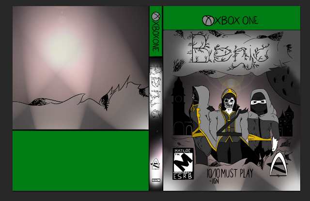
I then moved onto my characters, I needed add more shadow to add depth and make them stand out more on the hierarchy, adding shadow also adds realism to my piece as the light source is behind them.
This is after I had added shadow.
I then used the same effects for the title in the spine as I did for the front cover to keep to a house style.

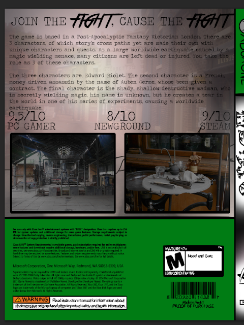
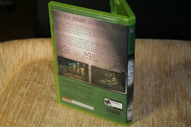
I used photos from contact sheet for my back cover, as they were more accurate to my game's theme.

I changed the font of "FIGHT" and their effect worked well as they stand out from the rest of text and are high up on the hierarchy of the back cover.

I then added another photo from my contact sheet to the background as before there was too much unused space.

I lowered the opacity of the old background and put the rest of the assets on top at full so they can still be read
Tuesday, 5 January 2016
Monday, 4 January 2016
Early Final Piece
To start my draft I wanted to incorporate elements from my Emulation into this piece. I took the inking I had previously done in the art style of "Craig Thompson". I felt the scanned in ink was not suited to my piece as when rendered in, appeared to be pixelated and difficult to edit. I used the threshold tool to turn my piece into a solid black and white, so I was then able to click on the white, and remove it, leaving just a black outline for me to work on top of.
By lowing the opacity down from 100% to 25%, it faded out the black so it was not so harsh, and my new lines can easily be seen above it. I then added a white background beneath it all, so the "checkered pattern" Photoshop uses to show transparency does not obscure my work when I try to trace it.
I then set up my brush tools, I enabled pen pressure to give a more realistic effect to my brush, kept opacity to 100% so the lines were bold and stood out, and kept the same brush size and hardness for most of the piece to keep it professional and neat.
I then drew on top of my previous work, I believe this new piece to stand out a lot more, and have crisper details. As it wasn't pixelated, I could still easily edit my piece when needed as I already had the same brush used to originally make it. I have still kept elements of my artist in my piece. By using darker colours such as black, I am adding a low key to the areas, and there make them lower down on the hierarchy.
It was at this stage, when I needed to consider a colour scheme, I was willing to try a range of colour schemes, starting with monochromatic. But instead of using gold of different tones and saturation, I decided to take a minimalistic approach, and use very low amounts of colour, this drastic low amount of colour makes my main characters stand out and become a high priority on the hierarchy.
I then added tones to my characters that ranged from high key (white) to low key (black). The colours were so saturated, they remained as just toned and no elements of colour were in them.
I then added tones to the smaller details on my piece, this would add a sense of depth to my piece and create elements that the audience could pick out over time, and gain their interest in my art. These smaller details are far down on the hierarchy as their purpose is to engage the audience, and become less obvious to see at first glance.
I then added tone to the top and bottom of the piece, these needed to appear to be in front of everything else, and stand out on the piece, I achieved this by using a higher key, (use lighter tones). I also wanted it to appear as smoke, so to do so I lowered the opacity of it down, and when a background is added, the opacity change will become more obviously and give a foggy effect.
For my template, I decided to attempt to do it hand drawn, to see if it works with my piece better, but at later stages I can try a professional template to see what works best.
Now I needed to create a detailed background that will help support my hierarchy, and remove white space so that my piece engages the audience. The first steps were to create a basic background using the gradient tool. Using this with tones would make my work appear less bland and more realistic.
The second step was to add a lens flare, coming from the direction I intend for my light source to be from. Having the light source from the center, will make my characters stand out more on the hierarchy. As well as lens flare, I added three spotlights, to go with my three characters. This light sources would once again added emphasis to my characters and draw the audience's attention.
I then needed to remove some areas of the background, to allow the white to show through, this meant that my text was easier to read and stood out because the two main features that I want to stand out on my piece are; characters, title and the rating.
I then needed to bring in other conventions a game cover has, such as the spine and the back cover, I created a new document that had space for these new features I was going to add.
I drew the lineart for the spine, keeping to my hand drawn style and re-used the same title.
I kept to the conventions of a spine, and included the title and the game developer's logo. I also used the same style and colour scheme, to ensure flow was kept in the piece.
I then sectioned off certain areas of the back cover, some of which would be about the game, and the other about the platform I will create it on (Xbox One).
I browsed the internet to find a suitable template to use as a reference for my hand drawn template, I may even consider using this template for my final piece.
I then added colour to it, for the top section of the back cover, I re-used a section of my background, so that a more obvious theme was kept and it flowed from all 3 sections of the piece.
I added some conventions of a back cover, using elements from my reference in it.
To add more conventions that featured in a back cover of a game, I included a short description of what is to be expected of the game, I used certain elements that were written in my synopsis of the game. I also included ratings of the games and a slogan that goes alongside the title.
I needed to feature gameplay of my game on the back cover as it is also one of the conventions commonly put it a back cover, so I found games that had the same atmosphere as my game cover and filled up empty space with them to keep my page busy and interesting.
My finished early draft.
Improvements for my final draft
Saturday, 2 January 2016
Emulation
From my emulation, I had found certain techniques my artist had used, and decided to create an emulation of this artist's work using ink, but editing it in Photoshop.
Using a lightbox, I traced over my draft with ink and scanned it into Photoshop ready for editing.
I then used the threshold tool on my scan.
I used the magic wand tool to remove the white, and I then had a clear black outline for me to put in colour.
I then added colours to my work, using a specific complementary colour scheme of yellow and purple.
Thursday, 19 November 2015
Artist Copy
For my artist copy, I decided to pick a page from a comic book called "Blankets", an autobiography of the author and illustrator, Craig Thompson. Before I could begin copying his art, I needed to analysis the page and decide what media to use, the art he has done was done using a media of ink and brush.
Before I could begin adding ink, I need a guideline to follow to ensure it is as accurate to the original. But to avoid plagiarism, I decided to drawn the pencil guidelines free-hand (Meaning I refrained from tracing the original).
Below is the finished pencil outline put against the original for comparison.
After I had done the guidelines, I was able to begin applying the ink, as the pencil was all my own work, tracing the pencil was not an act of plagiarism, using a light box I was able to see my pencil guidelines previously drawn and apply ink on top of it using a range of brushes for different thicknesses.
I did this technique for each section on a separate piece of paper, some I had made previous mistakes on, and then I improved gradually.
Within Photoshop, for each item I used the threshold tool to make them a solid black and white, to give my piece a bolder style, after this I merged each piece into one final piece that is a better mimic of the original.
After I had pieced it together in Photoshop, I printed it out and this is my final piece, my finished emulation of Craig Thompson's "Blankets".
Below are the two pieces put side by side for comparison. The original on the left, and my emulation on the right.
Subscribe to:
Comments (Atom)


