Following from my improvements, my next task was to bring my title higher up on the hierarchy, I decided to achieve this by adding a white glow on the outside, and making the lines thicker with the stroke effect.

This is the final design of the title.

This is the final design of the title.

I then moved onto my characters, I needed add more shadow to add depth and make them stand out more on the hierarchy, adding shadow also adds realism to my piece as the light source is behind them.
This is after I had added shadow.
I then used the same effects for the title in the spine as I did for the front cover to keep to a house style.

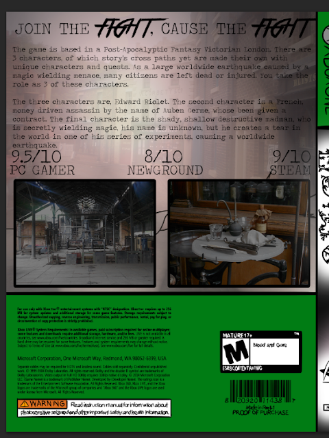
I used photos from contact sheet for my back cover, as they were more accurate to my game's theme.

I changed the font of "FIGHT" and their effect worked well as they stand out from the rest of text and are high up on the hierarchy of the back cover.

I then added another photo from my contact sheet to the background as before there was too much unused space.

I lowered the opacity of the old background and put the rest of the assets on top at full so they can still be read


No comments:
Post a Comment